 Step right up, get yer 2,015 album covers right here at Music to Eat! Well, we don’t really have that many covers, but let’s look back at a selection of covers from the last year.
There were a lot of interesting graphic design, photography, and illustration ideas manifesting themselves in the music world. At their best, they enhanced the music, and added another component to the overall package, enriching the listening experience. At their worst, well, we’ve tried to steer away from most of those (though a few may have snuck into this retrospective…we’ll let you decide which fall into that unfortunate category).
To begin with, some covers proudly (blatantly?) echoed past covers by different artists. That doesn’t necessarily make them “bad art”, as they’re still enjoyable (if a bit unoriginal in their execution). Two examples are Ryley Walker’s Primrose Green paired with Van Morrison’s 1970 His Band and the Street Choir and Meg Baird’s Don’t Weigh Down the Light paired with jazz saxophonist Sahib Shihab’s Summer Dawn, from 1964. (To be fair, a lot of artists did double exposure covers in 2015, but Walker’s seemed the most like a previous one to me.)
(click on all below covers to embiggen them)


Certain themes ran through some of the cover art of 2015~
Suspense and calm both work well in Silhouette:

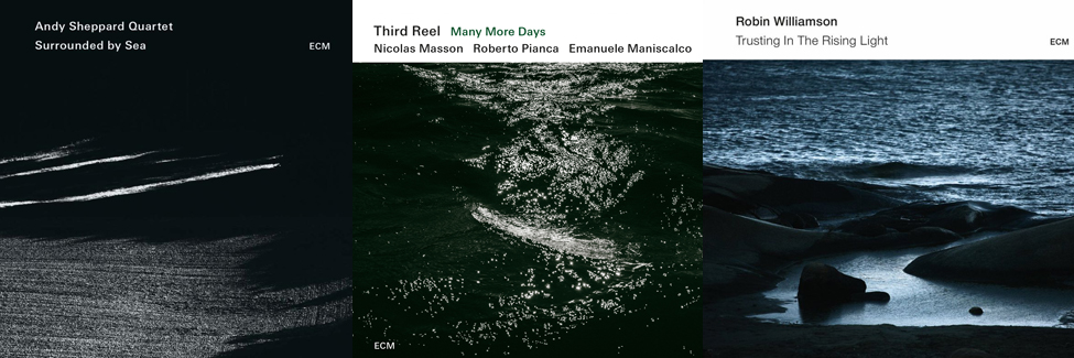
The Eternal Sea (most evident in works released by the ECM label) haunted our dreams:
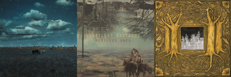
And let’s not forget The Wild Frontier:
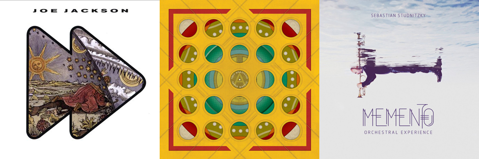
Or Psychedelic Patterns:

Speaking of patterns, Circles in the Sky were popular:
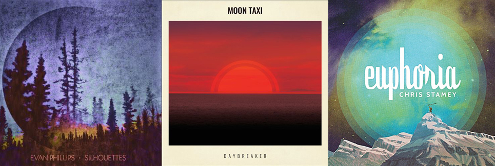
As were Dusk and Night Skies:


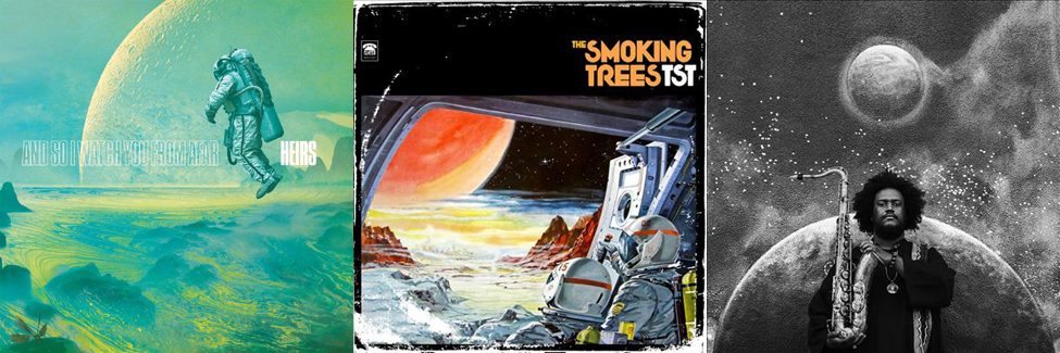
Which leads us, naturally, into Cosmic Domains:
And other Exotic Landscapes:

Which may or may not be populated by Monsters & Robots:

The Spooky was well-represented (beware of women with no face):

Other portraits portrayed the subject’s Identity Crisis as well (though I guess Freedy knows who he is, he just had a bad experience with a faulty neon sign):

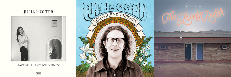
Then again, we had some memorable Portraiture that harbored no secrets (duos and solos):

Diagrams helped us make sense of things (well, maybe not the one with the cats…)

The Illustrated cover was popular in many forms and styles, often incorporating humor:


The low-key cassette revival featured two rustic, yet affecting, illustrations, on the Scissor Tail Editions label:

City Landscapes were mostly inviting:

And more City Scenes (these by photographer Fotimi Potamia, who’s definitely got a theme going here) highlighted a further selection of ECM Records releases:

Sometimes it was the Typography that really made the image:

While others went for Saying it Simply (the irony of James McMurtry’s album title is not lost on us, and the apt choice of the horse hairstyle gracing the cover of the album by the appropriately named Widow’s Peak is clever as well):

Closing things out, here’s a few covers worthy of display that are still floating around the Music To Eat headquarters, heretofore untethered to a theme:
2,016 album covers are sure to fill 2016.

Like the psychedelic patterns !