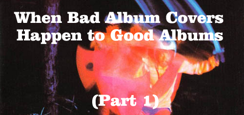
 Sure, finding bad album covers is easy to do – whole books and websites have been devoted to the failed and unintentionally humorous in album cover art. Yet, usually in those examples the music is just as bad as the cover. What’s more interesting to me is when bad album covers happen to good albums.
In such cases I can’t help but wonder how an awkward or badly executed cover by an established artist, or one on a successful record label, managed to slip by. Shouldn’t somebody in the art department, or in marketing, in management, in administration…someone, much less the musicians themselves, have caught these stumbles before the album was released to the record buying public? Usually, gaffes such as what was almost the cover for the first Van Halen album are caught in time. Others weren’t so lucky….
(Parenthetical aside: I should note that, of course, my definitions of “good” and “bad” are just my opinions. However, in the examples I highlight my thoughts seem to be shared by a general consensus. These are albums that were, or are now, critically praised and/or received a fair amount of radio play (not that that qualifies something as “good”, but that’s a whole ‘nother discussion.)
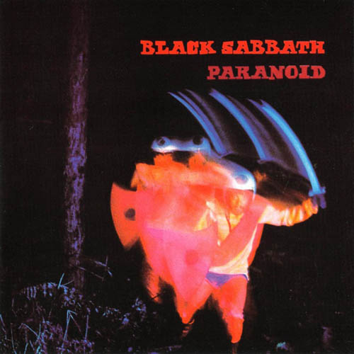
Black Sabbath had major cover art malfunctions, on, not just one, but two albums well regarded by fans. Paranoid is considered a heavy metal classic and Sabotage, from 1975, has come to be thought of as one of their strongest works. But the covers, oh the covers. Let’s let Sabbath bassist Geezer Butler fill us in about Paranoid: “We had originally wanted the record to be called War Pigs, and that’s what the record company was planning as well when [they] came up with the record cover, which is really horrible to begin with. We didn’t like it at all, but the label put it together, so we were stuck with it. The cover was bad enough when the album was going to be War Pigs, but when it was Paranoid it didn’t even make sense [laughs].”
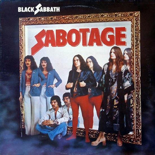
Sabotage takes the cake (the cake spiked with acid), though. From a PopMatters article on the album:
“The original idea for the cover of Black Sabbath’s sixth album was a great one. The four members of the band were going to be dressed all in black suits, standing in front of full-length mirrors in a big, creepy corridor of an old castle with stained glass windows. According to drummer Bill Ward’s assistant Graham Wright, the image would be ‘reversed like a Magritte, so it was their image being sabotaged.’….
As the story goes, the inmates were running the proverbial asylum as everyone gathered at a London studio. Nobody was prepared, the label wanted one thing, management wanted another, and nobody had bothered telling the band what they were supposed to wear. In the resulting photo Ozzy Osbourne is wearing a long kimono, hiding the fact that he has nothing on below. He’s “commando” because he’s lent Bill Ward his checkered underpants. Ward is wearing Ozzy’s underwear because he hadn’t bothered to show up wearing pants. To look a little more presentable Ward has borrowed the red tights his wife Mysti was wearing at the shoot, with the checkered underwear clearly visible on the back cover photo. So in the end you have a stylish, very mid’ 70s-looking bassist, a businesslike guitarist sitting with a stern expression, a kimono-clad singer with nothing on underneath, and a drummer wearing his wife’s tights over the singer’s underpants. And a leather jacket, because after all you had to complete the ensemble somehow.”
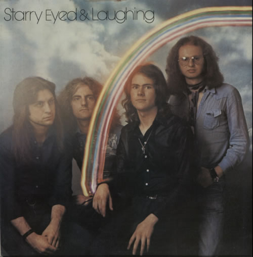
The 70s band Starry Eyed and Laughing (named after a line in a Dylan song) didn’t achieve superstardom with their brand of CSN and Byrds-influenced rock, but generated a loud buzz with their first album, plus, influential British DJ John Peel liked them. They opened for everyone from Weather Report to Toots and the Maytals, but it didn’t translate into longevity or name recognition. The covers of their only two albums could have been part of the problem. In the first, we’ve got a rainbow that looks made of toothpaste, and an awkwardly posed band who look like they were coerced into doing the cover shoot. The guy on the far left has gone catatonic with boredom and the frizzy haired guy next to him is ready to punch the photographer. The other two guys are holding up a bit better, but would rather be at the pub down the street playing darts.

On their second, Thought Talk, the guys are in floating transparent cubes for some reason. The rainbow makes a reappearance, but at least this time it’s real (well, okay it’s airbrushed in, but at least it’s in the sky). The whole thing is vaguely like the “futuristic” covers some jazz fusion bands employed in the late 70s. Actually, it looks very 1980s too…maybe they were ahead of the curve with this one! Then again, maybe not…
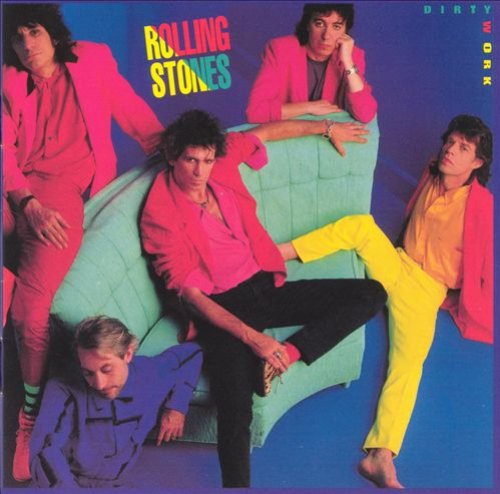
Speaking of the 80s, the Rolling Stones issued Dirty Work in 1986. The cover screams Miami Vice, and malls and plastic. The aging lads are attempting to be the epitome of casual in an extremely posed looking shot which negates any natural casualness. Charlie’s propped up on the floor, while Mick looks like he’s fallen off the couch, perhaps kneed in the crotch by Keith. The only dirty work going on here is the eye damage inflicted by the retina-melting colors of their suits. Granted, it was an attempt to make them look contemporary for the times, which seemed to work, as “Harlem Shuffle” and “One Hit (To the Body”) were fair-sized hits. The album has also been reappraised over the years, with many publications naming it as one of the most interesting of the Stones’ career. The cover sure was interesting, for all the wrong reasons.

The Go-Betweens released 16 Lovers Lane in 1988. Considered by many the band’s masterpiece and one of the best albums of the decade, it’s often referred to as their Rumours due to the inter-band romantic drama that fueled many of the songs. So why is the cover so unrelentingly dull? It seems like somebody took some random pictures of the band members and pieced them together haphazardly, using a palette of equally dull shades of grey. Robert Forster, one half of the band’s leadership duo (the other half being Grant McLennan) & singer/writer of half the songs didn’t even make the front cover!

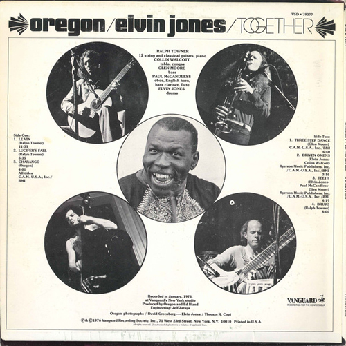
Another entertaining album cover story goes with the botched art for an album called Together which paired atmospheric world music/jazz quartet Oregon with dynamic jazz drummer Elvin Jones in 1976 on Vanguard Records. The music came off well, but the cover, that’s a different story. As Oregon’s guitarist Ralph Towner tells it in this interview:
“What happened is we had a gig in upstate New York and we drove back down to the city and went to this photographer’s place. Elvin wasn’t there. Then pretty soon, we hear a ring on the buzzer down from the foyer of this building we were in. We went down and there was Elvin collapsed in the foyer. He had disappeared for four days in the city and gone on one of his famous binges. He was having what appeared to be a heart attack and was in a cold sweat. So we called the ambulance and were tapping him and hoping he was okay. He went to the hospital and was okay in a couple of days. We visited him and then went back to the photographer’s studio as these sourpusses and had pictures taken of the four of us. So what do they do? They put this picture of the four of us on the cover and put this big smiling picture of Elvin’s face on it like a sticker glued on top with these drumsticks around it. The art director was so bad. It just looked strange and like an afterthought. So, Elvin missed the photo session, but he was fine.”
And it’s even a bit worse than that, as closer inspection reveals they aren’t even drumsticks but some red/orange lines added to the image later. The back cover wasn’t much better, as Elvin still looks very out of place. “Together” is definitely not a likely title that comes to mind for the album (“get it together, man!”).
——
Part Two/2/Too coming soon….

Reading this reminds me of Radiohead’s “The Bends.” It’s my favorite Radiohead album, but I can’t stand to look at the cover. I re-folded it in the CD’s jewel-case so that I see the band members’ photos instead.
Yikes, that is an ugly one…
That would be “Grant McLennan” for the Go-Betweens, not Grant Phillips…
Thanks for catching that stupid mistake I made. Just corrected it.