
And the journey continues on from Part 1…..

Pity poor John Martyn. He went into the studio in the early 90s to re-record some of the best songs from his career for a new album. Not satisfied with the results, he went back in the studio to give it another go. Meanwhile, his record label (the now defunct Permanent Records) went ahead and released the original tapes anyway, without his permission, borrowing the title Couldn’t Love You More from one of his songs. This was bad enough, but to add insult to injury, the cover art is wacko. It’s as if the designer got one of those “anonymous toddler” picture inserts used to sell picture frames, and then under the influence of drugs (or perhaps he had double vision problems) put the cover together. Suffice to say, the child was not even Martyn’s – plus, the title song refers to a romantic love, and is not a paean by Martyn to one of his children.
Martyn did everything he could to sabotage Couldn’t Love You More’s sales, badmouthing the album in interviews (I think at one point comparing the listening of it to being massaged slowly by sandpaper, or something like that). Honestly, though, his own version of the re-recorded tracks, released the following year as No Little Boy, doesn’t sound all that different to my ears. In general, the new versions don’t match the originals, but on their own merits, they’re an enjoyable and soothing, mellow listen.
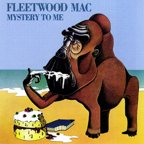
Then there have been bands which did choose their own artwork and maybe shouldn’t have been allowed to. Take Fleetwood Mac’s 1973 Mystery to Me, for example. It was one of the strongest albums they’d done since the departure of founding member Peter Green, (but still pre Buckingham & Nicks days) and contained Bob Welch’s timeless jazzy blues-pop radio staple “Hypnotized”.
The album cover, though, was indeed a mystery – a painting of a large ape-like animal (sort of bear looking also) on a beach tasting the icing from a cake, its lips dripping. A book lies off to the side, a bite taken from it as well. The back cover foldout doesn’t really clear things up, showing an old “wise man” in a robe proffering another book to the ape bear creature. Oh, and a penguin lurks in the background – probably a nod to (or special request by) bassist John McVie, a big fan of the waddling birds. According to an old interview with Welch, the cover “was meant to mean, sort of, ‘no matter how we stuff ourselves with knowledge, we’re all still monkeys’…The band ‘commissioned’ the illustrator, who I think was a friend of Mick’s sister….”
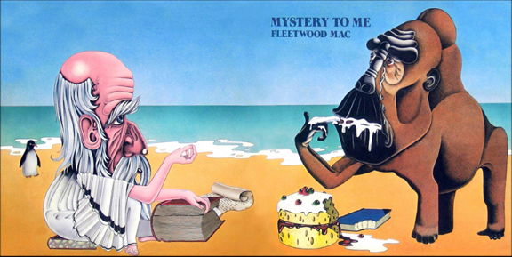 The artist is unnamed in the album credits, with the picture/album design just credited to “Modula”, which upon further research seems to have been a partnership between three graphic designers who also did covers for Camel, Curved Air, … and Fleetwood Mac’s previous Penguin album. Similar art styles to Mystery to Me, less muddled concepts (and more penguins, plus camels of course…)
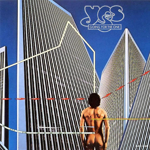
How ’bout Yes? Known throughout most of the 1970s for their iconic album covers by fantasy artist Roger Dean, as soon as they decided to change their cover approach, they fell flat on their face. Going for the One was a departure in some ways for the band as they gradually moved away from lengthy prog rock epics and it contained the moderate hit and most accessible song of their career thus far, “Wondrous Stories”. The cover of Going for the One, though, shows that not everything design team Hipgnosis (Led Zeppelin, Pink Floyd, etc.) touched was gold. Here a naked guy stands before a bunch of skyscraper office buildings (phallic symbols, as at least one writer has referred to them) while little colored lines intersect the image in dots and dashes. It’s futuristic! It’s symbolic! (?) He’s going for the one! Which one? What one? Is he going for a big job interview in one of the buildings? He may be more successful if he puts some clothes on first.
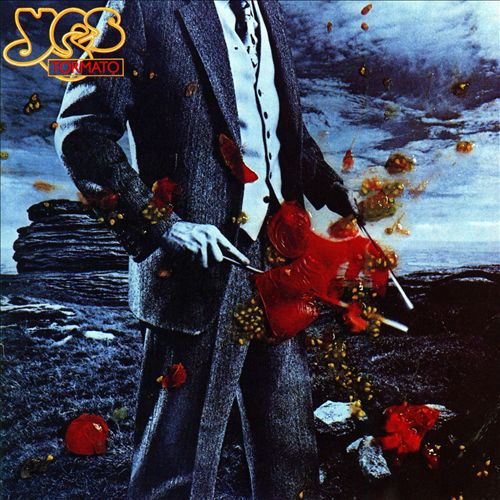
Yes’ next album was called, um, Tormato and showed a picture of a guy in a suit, holding divining rods, with tomatoes splattered all over the picture. If he was divining for tomatoes, he found ’em. It was, like Going for the One, designed by Hipgnosis (who seemed to be running out of inspiration in this part of the decade…their cover for Led Zeppelin’s Presence was a bit questionable as well) and one story is that band keyboardist Rick Wakeman had thrown a tomato in disgust at the cover workup presented to the band. Another story says it was Hipgnosis designer Aubrey “Po” Powell who threw the tomato. Either way, we have a photo that a tornado of tomatoes has passed through. While arguably a more interesting cover than Going for the One, the title and art trivialize the music contained. For a band like Yes to loosen up and appear less serious is one thing, but such an extreme leap to comedy was maybe not the wisest move at that career juncture as Tormato sold poorly and the cover was sure to have confused some fans. Still, it would have worked well for Monty Python.
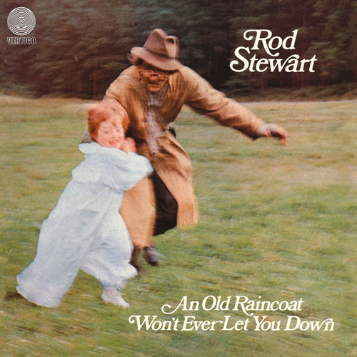
The cover of the UK release of Rod Stewart’s first solo album is so ridiculous, it seems like a joke. Titled in that country An Old Raincoat Won’t Ever Let You Down, it features a photo of a crazed looking old guy in a raincoat/trenchcoat chasing a young girl in a nightgown. Granted, she is laughing as if it’s a game, but the effect is still pretty disturbing. It was designed by Marcus Keef, who also did Black Sabbath’s Paranoid (from part 1 of this article). The thing is, Keef designed a lot of good covers as well, but of course he was only human, as were the Hipgnosis team – not everything is going to be perfection, and that’s okay.
 However, back to Rod – the U.S. record company seems to have said “Forget that!” to Keef’s cover (and the title) and gone in the complete opposite direction, giving it the most unimaginative title possible – The Rod Stewart Album – and giving it a dull mustard brown monochromatic cover, with no picture whatsoever. It’s as if they saw the alternative and just threw in the towel and gave up trying to design anything at all. The music, however was quite good, helping to launch Stewart’s multi-million selling career (with the artistic triumph of Every Picture Tells a Story just two years away).

Which brings us to the rarest achievement in album cover art…a cover so intentionally bad it’s great. I’m talking about David Bowie’s The Next Day, his first return to recording after a 10 year hiatus and his next to last before his death. The music was critically acclaimed and the album charted high, despite the album art simply taking the cover of his 1977 Heroes and pasting a white square over the center, with “The Next Day” in a plain, non-nonsense font, the original “Heroes” crossed out. It almost looks like a small child designed it, or that it’s a work in progress, but there’s actually a lot going on here, as designer Jonathan Barnbrook explains in detail in an interview on his blog. To summarize:
“The Heroes cover obscured by the white square is about the spirit of great pop or rock music which is ‘of the moment’, forgetting or obliterating the past…. We worked on hundreds of designs using the concept of obscuring this cover but the strongest ones were the simplest – it had to be something that was in direct contrast to the image underneath but that wasn’t too contrived (we know all design is contrived, that is the essence of the word ‘design’). It would have been clearer to many people if we had scribbled all over the cover but that didn’t have the detachment of intent necessary to express the melancholy of the songs on the album. Obscuring Bowie’s image is also reference to his identity, not only in the past when he changed endlessly but that he has been absent from the music scene for the past ten years. Was this an act to hide his identity or that he has simply become more comfortable with it?”
The cover is startling in its audacity and makes an artistic statement, as deceptively simple as that statement may appear. A rare (the only?) example of “When Good Bad Album Covers Happen to Good Albums”.
