Jazz flautist Herbie Mann’s 1971 album Push Push is widely considered one of the worst examples of album cover art ever, noted online and in books on the medium. (In fact, The Art of the LP, by Morgan and Wardle, devotes a lengthy paragraph to the cover which starts out with a response to the album’s title: “No No”.)
Yet, compare Push Push with one of Mann’s firsts, from 1954.

A nerdy looking guy plays a flute with an owl perched on the end of it. It’s another world entirely from Push Push. How did we get from an innocent and funny picture with an animal mascot to a photo of a (let’s face it) sleazy looking, naked and hairy Herbie? A lot of ground was covered in his album covers during the time between and the time after. Prolific only begins to describe the recorded output of Mann, which explains why I’m always coming across another of his wacky and weird album covers in record stores.
Before we tour through some of these, a brief synopsis of “Super Mann” (yes, one of his album titles) is in order (for more info, see Wikipedia). With a career that stretched from the early 50’s to his death in 2003, Mann was known for fusing “world musics” with jazz, for a late 60’s/early 70’s critically lauded peak which found him playing with luminaries such as Duane Allman, Larry Coryell, Sonny Sharrock and more, plus a long foray into light funk/easy listening sounds. He covered all the bases at one point or another: jazz of all kinds, reggae, disco, pop, rock, R&B.
Along the way, one could always count on albums titled after puns on his name: Mann Alone, Mann in the Morning, The Mann with the Most, A Mann and a Woman, The Family of Mann, Our Mann Flute, Moody Mann, Great Ideas of Western Mann, The Evolution of Mann, Early Mann, Super Mann, African Mann, Latin Mann, and of course Herbie Mania. The irony of it all is that Mann wasn’t even his real last name, it was Soloman.
For this blog post I wanted to explore the endlessly fascinating and eccentric album cover art of Herbie Mann. But how to categorize it and break it down into digestible chunks? For an almost complete overview of the 75+ titles under his name (including compilations), I’m gonna steer you to Discogs. I was originally going to separate some chosen covers into headings like The Good, The Bad and The Weird. But, I find myself having a hard time judging these creations in such a way. A cover like Waterbed, for example, could easily be considered “bad,” with it’s cheesiness, but then, is it really? So many of his covers are groan-inducing, but they’re memorable- and isn’t that the goal of this type of graphic art? (Okay, Push Push is memorable, though not in a good way…)
So, rather, let’s take an incomplete though no less entertaining, journey through some of his covers. Some are obviously bad, but many more fall into a gray area for me (your mileage may vary!)
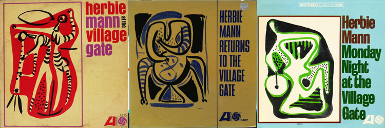
Let’s start with a trio of 60’s covers we can safely say are “good.” These live at the Village Gate LP’s were designed by David Stone Martin , one of the most collectible of album artists these days. They echo the mid-century modern, almost Picasso-esque style in vogue at the time.
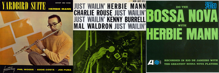
On the other end of the spectrum, these are three of the worst covers I’ve seen by anybody. The first has the flautist accompanied by what look like large squares of Kraft American cheese slices. Art Director: “Herbie, my main man, make sure you wear your cheese colored sweater too. Got it, Daddy-O?” Just Wailin’ features carousel horses in pain…given a green hue to make it more “arty”. Do the Bossa Nova was, surprisingly, issued on Mann’s longtime label, the megalith Atlantic. But it looks like here their budget for cover art ran out that month.
 Our Man Flint was a James Bond styled series of movies in the 60’s. Today! Mr. Mann will send you to the optometrist to have your eyes checked. I guess you could say Surprises is whimsical…but multiple technicolor Herbie Chickens? Somebody was smoking too much of something…
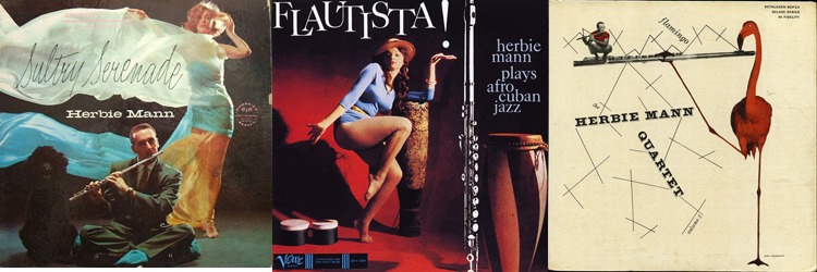
She gazes longingly at the camera while the pied piper plays at her feet…accompanied by a large poodle. On the cover of Flautista! our beatnik model strikes a pose not too dissimilar than the flamingo on an earlier Mann album.
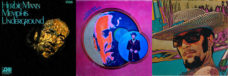 In the late 60’s and early 70’s, Herbie got more funky and Southern and his album covers generally reflected this. Memphis Underground has a nice, moody portrait of the musician rendered in peeling paint (or else he has a bad skin condition), the blue of the text and the choice of font giving a sophisticated feel. Mississippi Gambler is an odd hodgepodge of 60’s psychedelic and turn of the century portraiture with Mann attired as the gambler. Memphis Two-Step is one of the first to feature his new taste in wide-brim hats and his 70’s penchant for things beachy…
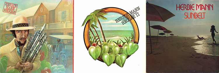
Reggae has a decent painting of Mann as an international man of mystery (Mann of Mystery being a lost album title opportunity, actually) and flute collecting. I can see it now: “He travels the globe. Sultry ladies, danger and flutes his only companions…”. Sunbelt, well, that one looks like a mid 70’s airline tourist brochure.
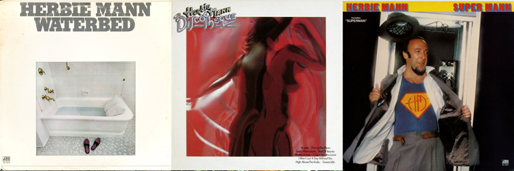
Waterbed…well, it speaks for itself. On Discotheque, we have one (two?) people struggling to escape from a large sheet of cellophane. Super Mann is …. not so super, but you get the idea that Herbie knew it was bad and just went with it anyway. We can laugh with him with this cover.
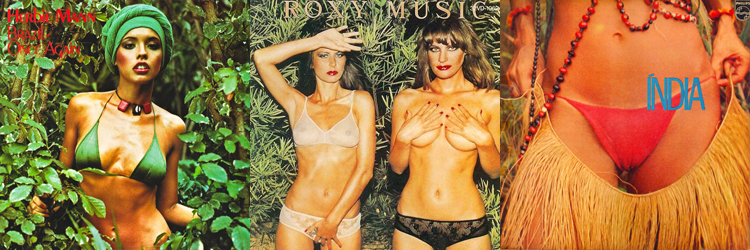
What better way to end our little tour of some of Herbie Mann’s album covers than with 1977’s Brazil: Once Again, the inverse of Push Push – featuring a scantily clad woman on the cover. Echoes of contemporaries Roxy Music’s Country Life (1974) and Brazilian singer Gal Costa’s India (1973) resonate particularly strong in this design.
I’ve been sardonic in my comments on some of these covers, but in truth, I like them all no matter how “bad” they may be. That’s part of why I like them!
I can think of no other artist who had so much fun for such a long time with his album covers (whether it was always intentional or not).
